Success Story: A Responsive Solution for the Toronto School of Theology
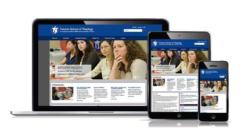
TST.edu
"The new website is fantastic. I . . . am still having fun exploring all it has to offer."
- Board Vice-Chair, Toronto School of Theology
The Opportunity
-
intuitive navigation;
-
Accessibility for Ontarians with Disabilities Act (AODA) compliance;
-
a robust search functionality;
-
streamline the updating of the course catalogue;
-
a secure log-in area for staff and faculty;
-
a well-functioning listing tool for events and news;
-
a calendar view for events and an online submission form for news and events items;
-
social media integration; and
-
video integration;
The Solution
TST is one of the many higher educational organizations that employ the open source CMS technology that is Drupal. The Drupal stack proved to be the perfect choice for TST because of its open source and community-driven nature and the added bonus of no fees associated with licensing or maintenance of the underlying software (Drupal, Apache, PHP, MySQL, Varnish, modules, Solr, git, etc.).
TST.edu was previously running on Drupal 6. Over time, several areas were identified that could be improved in their workflows and user experience. The redesign and upgrade to Drupal 7 allowed for TST to enjoy improvements in content editing, workflows, user experience and more.
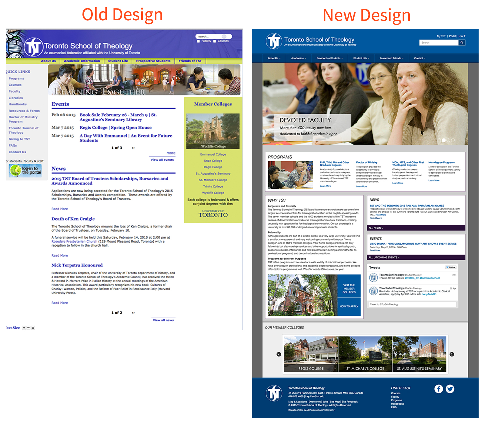
Landing Page Restructure & Visual Renewal
"The 'Find it Fast' is a clever and convenient new feature. Very straightforward and intuitive . . . am impressed by the design."
- Professor, Toronto School of Theology
SEO Improvements
Responsive Design
Course Catalog & Add to Favourites
The Function1 solution included the listing of available courses from all member colleges on one page as well as an optional search method. Users are able to search courses by College, Session Offered, Start Time, Course Code, Course Title, Course Level and if the Course is available to take online. Current (or prospective) students are also able to add Courses to a Favourites List that will save for a period within cookies.
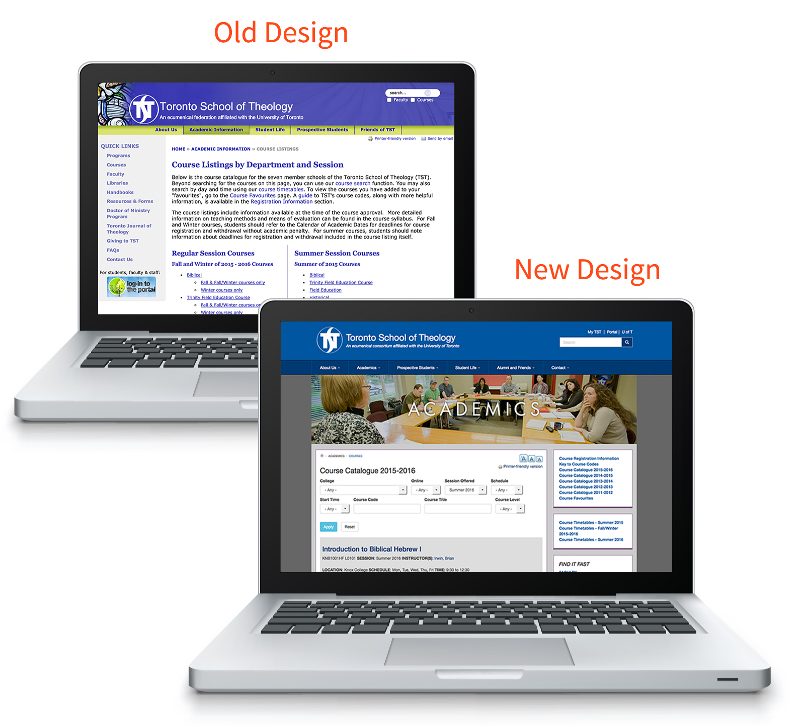
The TST.edu Course Catalogue as shown Before (top) and After (bottom).
Social Media Integration
In addition to the TST twitter feed displayed on the revamped landing page and social channel links showcased in the footer, all courses can now be shared by users via social share. This provides a huge marketing and recruitment benefit for the school as social media becomes more ubiquitous with each passing day. Currently, 74% of all internet-using adults spend time on social networking sites. That number only increases for adults aged 18-29, as 89% are using social media.

The TST.edu Social Media Integration - Social Share feature as seen on the Course Description page.
" . . . A huge improvement over the old site. I like that there was consideration of accessibility (print size, printer friendly version)."
- Student, Toronto School of Theology
Accordion Display
The TST site demanded the display of large amounts of content in an organized manner, so with that in mind the redesign solution utilizes an accordion type dropdown. This allows the user to expand to read only the information they are seeking so that they are not overwhelmed by the amount of content displayed on one page.
Newsletter Subscription
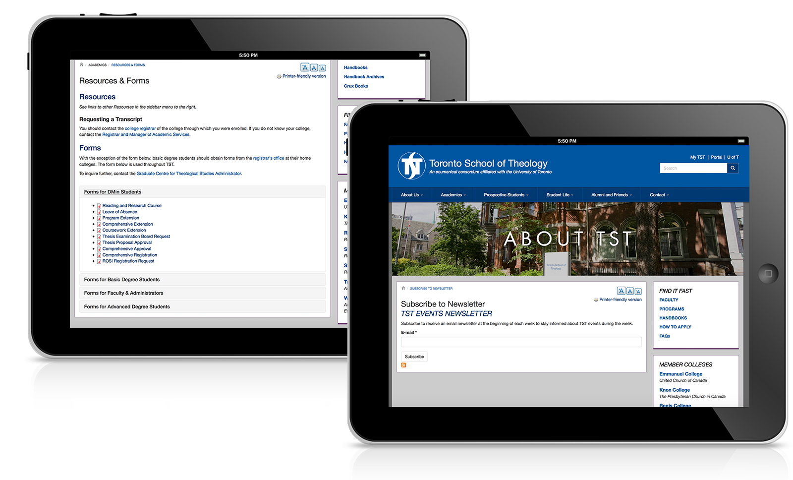
For improved user experience, site visitors now have the ability to submit their emails via the TST website to subscribe to the consortium's online newsletter and receive weekly updates regarding news & events.
The Outcome
At Function1, our goal is to develop and deploy solutions that make our clients successful. TST was already a renowned center of theological study, it was our job to bring their website up-to-date and back to life. Utilizing the open source, Drupal platform, we were able to deliver a well-designed, cost-effective recruitment and knowledge-sharing tool for a wide range of audiences. Not only does the new site better reflect TST visually for its end-users, it also provides an ease of use for content editors, which in turn will ensure that the site's content is always current and well maintained for years to come. We're only happy when our clients are; and their words speak volumes:
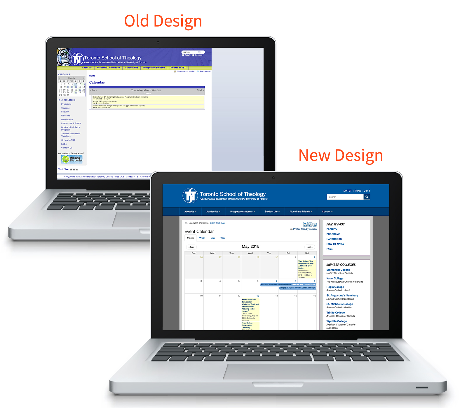
TST.edu Calendar Page as shown Before (top) and After (bottom).
"It is wonderful; So vibrant and informative."
- Board Member, Toronto School of Theology
Are you interested in obtaining a quote for your website redesign? Contact us at info@function1.com.
- Log in to post comments

