Organized Chaos

As a project manager, choosing the right project management tool for your company isn’t an easy task and organizations can take months (sometimes even years!) before deciding on a solution that fits best. You want a tool that can do it all; from internal projects, to client work, and tracking time - without the process having a huge impact on the company. After all, the goal is to help your team get organized, not cause more chaos.

So, how do you even begin your search? With the millions of tools available it can seem like a daunting task, but following the simple steps below can...


Using Splunk to Analyze New York City Uber Data

It’s fun getting all types of data into Splunk, analyzing it, and learning something new. I was pretty excited when I found this Uber trip data from FiveThirtyEight with 4.5 million records of Uber pickups from April - September 2014. Uber also debuted Uber Movement which is offering access to their data if you get on a waiting list. If you are interested in Uber data, you should definitely check that out. 

...


AI & The Redefinition of Content

Let's talk about AI! Why AI? Well, it's incredibly popular and trendy. An analogy can be made between AI and when Coco Chanel rid women of the corset fashion to a sportier, chicer outfit. Risqué, scary, unheard of, but oh so liberating and exciting!


If you have been living under a rock without internet connection or communication device, you might be wondering what AI (aka Artificial Intelligence) means. The best definition I could find is the following......


Overview of the New Charting Enhancements in Splunk 7.0

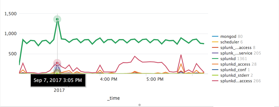
Charts are highly configurable in Splunk and in Splunk 7.0 they have added more charting options to use in your dashboards. These charting enhancements improve metrics and multi-series monitoring use cases while elevating user experience.

In this blog post, I will provide an overview of the new charting options available with Splunk 7.0 and give you examples you can use for reference. 

charting.lineWidth

The first charting option allows you to change the line width of your charts in pixels.   

In the the XML example below, I've taken it a little further...


Does Your WebCenter Sites Deployment Need a Health Check?

Just as you and I (should) go to the doctor regularly for checkups, major IT systems like WebCenter Sites should also get an occasional health check to ensure that they are operating at peak efficiency. As a complicated enterprise product, there are many potential issues that can impact WebCenter Sites’ performance, uptime, and ease of use. Some issues result from misconfigured settings, or problems that develop over time, including: performance issues due to memory usage, disk space, and database size.

If your environments are experiencing unexpected downtimes and users (or...


Stay In Touch